Posts Tagged With: Python

Scraping Tabular Data from Web Pages using Python

In my continuing quest to make sense of the baseball pitching data that I’m studying, I realized that I needed the game performance of the pitchers on whom I have pitching data. This helps validate any theories about what the data from training tells us about ability.

Since we’re using the 2024-2025 Brevard College Rapsodo data, we want to add the 2025 season statistics to see if our analysis of their fall and early spring data matches with their performance.

BeautifulSoup

The package I’m using to parse the HTML is called BeautifulSoup and was created by Leonard Richardson in 2004 (and he’s maintained & upgraded it [with help] for over 20 years!) We’re not going to do anything complex, but it is powerful.

We’re importing two objects from the library – BeautifulSoup to get all the HTML and SoupStrainer to allow use to choose what to parse. We also have to import pandas to put our table in memory and requests to get the document from the web.

from bs4 import BeautifulSoup
from bs4 import SoupStrainer
import pandas as pd
import requests

url = "https://bctornados.com/sports/baseball/stats"
r = requests.get(url)
html_doc = r.text
soup = BeautifulSoup(html_doc)

The Web Page

We’re very fortunate that the Brevard team’s web page is designed well. In particular, the section that contains the pitching data is tagged as “individual-overall-pitching”. This made finding and scraping the data far easier. It’s not odd to see web page developers leaving id’s off or for CMS systems to fail to include them. Here’s the top of the appropriate section on Brevard’s page:

<!-- Individual - Overall - Pitching -->
<section id="individual-overall-pitching">

This makes it very easy for us to acquire the tabular data and put it into a DataFrame.

only_pitching = SoupStrainer(id='individual-overall-pitching')

pitching_section = BeautifulSoup(html_doc, "html.parser", parse_only=only_pitching)

pitching_table = pitching_section.find('table')

pitching_data_df = pd.read_html(str(pitching_table))[0]

Quick transform on the name column

Since I realized this put some gobbledygook in the Player Name column, I did slip in code to modify that, but even if you’re scraping pitching data from somewhere, you might not need those steps, but here’s the code I used.

# Function to convert "Last, First Jersey#etc" to "First Last"
def transform_name(name):
if pd.isna(name):
return name
parts = name.split(',')
if len(parts) < 2:
return name
last = parts[0].strip()
first_parts = parts[1].strip().split()
first = first_parts[0]
return f"{first} {last}"

# Apply transformation
pitching_data_df['Player'] = pitching_data_df['Player'].apply(transform_name)

To Excel

Now, I wanted to know immediately how well this worked, so I dumped it into an Excel spreadsheet.

pitching_data_df.to_excel('brevard.xlsx', index=False)

Next Steps

Now that I have my practice data and my game data in DataFrames, I can start merging in the performance results when displaying practice data and drawing conclusions.

This series includes:

Categories: Python | Tags: , , , , , , , , , , , , , | 4 Comments

Aggregating CSV Data into DataFrames: Rapsodo Pitch Data

This week I met with Vinny Carone, the Head Baseball Coach at Brevard College, to talk about the data I’ve been acquiring on youth pitchers. I’ve been doing a lot of visualizations and wanted to know if they were meaningless visualizations. I do have some improvements to make based on that and I also got some CSV exports of Rapsodo data to work with. I’m very excited about the potential for insights and the opportunity to see them applied.

Quick Point on the Data Sources

The data I’ve been using comes from my PitchLogic baseball, which has some electronics in it to sense and transmit its movement. I’ve been exporting the data into CSVs and doing visualizations. When I export, I specify the data range for the data that I want and get all pitches thrown.

The college team is using the more expensive hardware – Rapsodo 3.0 – which gives much of the same data and location data that PitchLogic does not. It can also export data into CSVs. So far, we have only seen how to do it for individual players. So, aggregation and tagging of data to use all of the data was my first task.

Walking the directory

Since I want to get data from many different files, we need to walk the directory. First, we have to import the os functions, so we’ll be able to create our DataFrames using pandas.

import os
import pandas as pd

# Directory containing the Rapsodo Data files
rapsodo_data_dir = 'Rapsodo Data'

# Initialize an empty list to store player data
data = []

Looping through all the files is now actually really simple. You don’t need to specify anything, except which directory to use.

# Loop through each file in the directory
for filename in os.listdir(rapsodo_data_dir):
if filename.endswith('.csv'):
# Construct the full file path
file_path = os.path.join(rapsodo_data_dir, filename)

Scraping the Player ID and Player Name

The nice thing when viewing the Rapsodo CSV files in Excel is that it gives you a label identifying the player (anonymized here) by ID and name. This is great when I’m viewing one player, but not real useful when I want to aggregate all the data and keep it tagged by player. So, we have to first treat the CSV file as text, then go back to read the data into the DataFrame.

        # Read the file as text in order to get Player ID and Player Name
try:
with open(file_path, 'r') as file:
for _ in range(3):
line = file.readline()
if not line:
break
if "Player ID:" in line:
player_id = line.split('"Player ID:",')[1].strip()
if "Player Name:" in line:
player_name = line.split('"Player Name:",')[1].strip()
except Exception as e:
print(f"Error reading {file_path}: {e}")

The AI in my dev environment in DataCamp urged me to use try-catch for error-handling. It’s always nice to know why and where an error occurred, so catch those exceptions!

Building that DataFrame

Once again, Python is pretty slick at how it handles data. Simple and elegant.

Read the CSV with all 106 columns into our temporary DataFrame, df, add columns at the front tagging each row with player ID and player name. Then, we put each temporary df into a list of DataFrames so we can concatenate them smoothly.

        # Read the file as CSV, skipping the first 4 lines in order to just get pitch data
try:
df = pd.read_csv(file_path, skiprows=4)

# Add Player ID and Player Name columns
df.insert(0, 'Player ID', player_id)
df.insert(1, 'Player Name', player_name)

# Append the DataFrame to the list
data.append(df)

except pd.errors.ParserError as e:
print(f"Error reading {file_path}: {e}")

# Concatenate all DataFrames in the list
final_df = pd.concat(data, ignore_index=True)

Conclusion

Now that I’ve got 2024-2025 Rapsodo data all in a single file, I can start working on team wide and individualized visualizations. One of the keys in our discussion was to create our own Stuff+ metric since we don’t have access to anyone else’s. That’s going to be the next blog post!

This series includes:

Categories: Data Wrangling, Python | Tags: , , , , , , , , , , , | 4 Comments

Quartile Boxes for Charting in Pitch Movement Visualizations

As I was looking at my PitchLogic movement visualizations that I’m using in coaching youth pitchers, I realized that I could use the quartile values to display how consistent their movement has been. The code is not that complex, so I wanted to make sure to share it. I imagine it will have considerably more uses than just my hobbyist one.

Defining the function

As my Python code for pitching assessment gets more complex, I decided to start breaking out pieces as functions. I had been using cols to create multiple charts of the various pitch types, but having a chart for each pitch type makes more meaningful charts.

For clarity, I made sure to add a good docstring…

def movementCharting (player_df, type):
""" create a chart of horizontal and vertical movement with a box around 'quantile area' showing where pitches go (separate function for creating a table of all pitch types and movement)

Args:
player_df (DataFrame): PitchLogic DataFrame with 'Horizontal Movement (in)' and 'Vertical Movement (in)'
type (string): pitch type to chart

Return:
filename (String): filename of PDF in which the image is stored
"""

Building the Chart

It only takes a few lines to build the chart using Seaborn. We’ve gotten the DataFrame that contains only pitches by one player and we trim it to only pitches of the type we’re charting.

    movement_df = player_df[player_df['Type']==type]
movefig = sns.relplot(x='Horizontal Movement (in)', y='Vertical Movement (in)', data=movement_df, kind='scatter')

Then we compute our quartile values and draw the box on the plot. I’ve commented out the lines for each mean value, since they added visual complexity without making the chart more meaningful. YMMV

    # Calculate mean and confidence intervals
    mean_horiz = movement_df['Horizontal Movement (in)'].mean()
    mean_vert = movement_df['Vertical Movement (in)'].mean()
    ci_horiz = movement_df['Horizontal Movement (in)'].quantile([0.25, 0.75])
    ci_vert = movement_df['Vertical Movement (in)'].quantile([0.25, 0.75])
        
    for ax in movefig.axes.flat:
#        ax.axhline(mean_vert, color='red', linestyle='--')
#        ax.axvline(mean_horiz, color='blue', linestyle='--')
        ax.hlines(ci_vert[0.25], ci_horiz[0.25], ci_horiz[0.75], color='blue')
        ax.hlines(ci_vert[0.75], ci_horiz[0.25], ci_horiz[0.75], color='blue')
        ax.vlines(ci_horiz[0.25], ci_vert[0.25], ci_vert[0.75], color='red')
        ax.vlines(ci_horiz[0.75], ci_vert[0.25], ci_vert[0.75], color='red') 

A couple of lines to put in the title in an appropriate spot….

    movefig.fig.subplots_adjust(top=0.85)  # Adjust the top to make space for the title
movefig.fig.suptitle(type + ' Movement Profile for ' + playerDisplay, y=0.90) # Move the title upward

Returning from our function

As noted in the docstring, we’re returning the filename as the value from the function. That gets dropped into an array so that it can be processed using Automate PDF Creation from Data Visualizations with Python

    filename = playerfigStorage + '/' + type + ' Movement Profile.jpg'
movefig.savefig(filename)
return filename

Conclusion

Visualizations aren’t hard to create using Python and there are many ways to make them more meaningful without excessive coding. As I work with my pitchers and they learn more about using this inter-quartile range box, they might pick up some technical knowledge and understanding of how to use visualization in their own lives.

This series includes:

Categories: Python, Visualizations | Tags: , , , , , , , , , , | 4 Comments

Visualizing Baseball Pitching: Loading and Wrangling PitchLogic Data using Python

In my hobbies, I’ve always used my technical skills to support the endeavor. Web pages for the Boy Scout Troop, an online database for the school painting & landscaping projects, spreadsheets to manage the baseball rosters, radar to measure throwing speed, and email to keep everyone in the loop. So, it will come as no surprise to anyone I’ve encountered in those that I’m taking data visualization into my baseball coaching. This also gives me a chance to break down the process here and provide an opportunity for others to learn from and extend the code. This is part of a series of posts, with snippets delivered in manageable chunks.

Learning on DataCamp

As I was looking around for ways to learn AI and to learn Python as a way to access it, I found DataCamp. It’s a great site for learning Data and AI. There are a variety of career tracks (Data Analyst, Data Engineer, and Data Science, among others) and you can sample without paying. Each course in a track is also broken down into individual lessons, which are just a few minutes long. This allows you to learn in digestible chunks. It also will re-cap your progress when you reopen a course that you’ve already started.

You also get 3 workbooks on the DataLab that practice with data from files, Oracle, and SQL among others. You can use Python or R to manipulate it or ask the AI to do something (or start something for you). I was initially only using it for the exercises, then started playing with my baseball pitching files.

It’s usually $330 a year, but sometimes can be secured at a discount for one person or for a team (mine was half off). Well worth your money!

Basics

My PitchLogic baseball records a lot of information about every pitch, examining the pitcher’s delivery, the release, and the movement of the ball as it travels to the plate. The ball is identical to a Major League baseball in weight and covering, but instead of cork in the center, there are electronics. This means that we never hit the ball, just throw it.

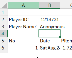
You can export the data from the app, getting a CSV file via email with all the pitch data for the selected date range. I was always opening this in Excel and manipulating it to try to see patterns and to learn what “good” numbers were for age groups and individual pitchers. I had all kinds of formulas for highlighting cells that looked like “good” numbers. With the data being in Excel, I could have created some charts to better understand the data, but it was time-consuming and I wouldn’t know where I’d find value until I put in the work.

I started using ChatGPT to create some charts based on the data in the same way it was done in the app and in session reports on the web. I was including data from all sessions, so it was a little different. I also looked at data from a few seasons ago, which had long left my app but was stored in spreadsheets.

ChatGPT lets you look at the Python it creates to do what you want it to do. So, I started modifying that and reusing it for different players. Somehow, I found DataCamp and then started using DataLab to examine my data in more detail and practice the Python that I was learning.

When I imported the data, I realized that I could use my newly acquired skills and wrangle the data a little. When I was doing all my analysis in Excel, I had some formulas to create new column values, but I did a lot of copying and pasting. By using Python, I can easily apply those to any spreadsheet I drop in.

First, I just wanted to create a Player Name field so I didn’t have to spend time checking both first and last name. Then I wanted to parse my Memo column to separate out location and intended pitch type.

import pandas as pd

# Load the CSV file into a DataFrame
pitchLogic = pd.read_csv('PitchLogic.csv',parse_dates=["Date"])

# Combine names to Player Name
pitchLogic['Player Name'] = pitchLogic['First Name'] + ' ' + pitchLogic['Last Name']
# Split the memo field between location and intended pitch type
pitchLogic['Location'] = pitchLogic['Memo'].str[:1]
pitchLogic['Intended Type'] = pitchLogic['Memo'].str[2:4]

The Arm Slot value is the angle on a clock face for the pitcher’s arm as he’s throwing. The Spin Direction is the same for the direction in which the ball is spinning. An arm slot of 1:30 would be throwing with your arm at a 45 degree angle to your torso. A spin direction of 12:00 would be a ball spinning forward perpendicular to the ground. I want to compute the difference between these two as a way of evaluating the pitch. For a fastball, you usually want them as closely aligned as possible. For accuracy, you want them to be the same every time you throw a fastball, so that it’s predictable.

Computing the difference between the Arm Slot and Spin Direction is only easy when you’re doing it manually. If you do it in Excel or HCL Notes, it can be a rather complex formula. In Python, it’s not bad at all once you convert it to a time.

from datetime import datetime

# Skip rows that are missing Arm Slot or Spin Dir
pitchLogic = pitchLogic.dropna(subset=['Arm Slot', 'Spin Dir'])

# Convert 'Arm Slot' and 'Spin Dir' to datetime objects
pitchLogic['Arm Slot'] = pd.to_datetime(pitchLogic['Arm Slot'], format='%H:%M')
pitchLogic['Spin Dir'] = pd.to_datetime(pitchLogic['Spin Dir'], format='%H:%M')

# Compute the slot difference in minutes
pitchLogic['Slot Diff'] = (pitchLogic['Arm Slot'] - pitchLogic['Spin Dir']).dt.total_seconds() / 60

# Adjust the slot difference if it is less than -360
pitchLogic.loc[pitchLogic['Slot Diff'] < -360, 'Slot Diff'] += 720

# Convert the slot difference to integer
pitchLogic['Slot Diff'] = pitchLogic['Slot Diff'].astype(int)

# Format 'Arm Slot' and 'Spin Dir' to display only time as HH:MM
pitchLogic['Arm Slot'] = pitchLogic['Arm Slot'].dt.strftime('%H:%M')
pitchLogic['Spin Dir'] = pitchLogic['Spin Dir'].dt.strftime('%H:%M')

There is some old data in my PitchLogic files, from before they had auto-tagging of pitch type. For simplicity, and since much of my old data was from very young pitchers who only have one pitch (fastball), I defaulted everything to FF (four-seam fastball). Many of the columns in the CSV export from PitchLogic have column names that have changed over time and may continue to change, so I have an example of how to rename one.

# Check if 'Type' column exists before trying to fill NaN values
if 'Type' in pitchLogic.columns:
pitchLogic['Type'] = pitchLogic['Type'].fillna('FF')
else:
pitchLogic['Type'] = 'FF'

# Rename the 'Speed (mph)' column to 'Speed'
pitchLogic.rename(columns={'Speed (mph)': 'Speed'}, inplace=True)

I enter pitch location data into the Memo field, and also include the pitch type that the player intended if that differs from the auto-tagging. It is very common for players under 12 to have pitch type differ on some pitches, but not others. For high school pitchers, they tend to stay in the same pitch type, but may think it’s something different. At one assessment, a very good HS pitcher was throwing sliders and cutters, thinking he was throwing curveballs and fastballs.

Summary

This should give a good idea of how to import and wrangle the PitchLogic data, or any data of your own, in order to prepare some visualizations. Keep an eye on this blog for other pieces in this series to help understand visualizations using Python.

This series includes:

Categories: Python, Visualizations | Tags: , , , , , , , , , , , | 4 Comments

Automate PDF Creation from Data Visualizations with Python

When creating some really great visualizations, I wondered how I could create a bunch of them and not be overwhelmed by the process of exporting them to PDF files to share with others. So I explored a few options and found that img2pdf was most suitable: always lossless, small, and fast. It allows me to loop through my data, creating charts, move them to individual PDFs, and then combine them into multi-page PDFs.

I’m using DataLab by DataCamp, where I’m learning Python, Data Science, and AI. So, some of my code may rely on that environment and YMMV. Installing and importing img2pdf was very straightforward for me.

!pip install img2pdf
import img2pdf

It turned out to be pretty simple to loop through my CSV data using one of the columns to get data by player and then create each graph, saving it as a PDF, then combining then as multi-page PDFs by player and by category.

I created a directory structure for the files, with a Fig Storage directory for all the individual PDFs and a directory for each team and year. This allows me to scale it to handle data at volume, letting me focus on analyzing that data instead of being bogged down in copying and pasting.

Within each loop, it creates an empty array, imagefiles, in which all filenames are placed, so that those files can be copied into the summary PDFs once the charts have all been generated. Outside the loop, there is another array, byDateArrayFiles, for storing all of the filenames to be bundled together for a ‘Velocity by Date’ file.

Here’s a sample of the loop with only two charts created. I have 8 different ones created for each player, but that would be excessive. This gives you the idea.

season = '2025'
team = 'ICI'
byDateArrayFiles = []
playerNames = pitchLogic['Player Name'].unique()
for player in playerNames:
player_df = pitchLogic[pitchLogic['Player Name'] == player]
imagefiles = []

bydatefig, bydateax = plt.subplots()
bydateax = sns.lineplot(x='Date', y='Speed', data=player_df).set(title='Velocity for ' + player)
bydatefig.autofmt_xdate(rotation=75)
filename = "Fig Storage/" + player + ' VelocityByDate.jpg'
bydatefig.savefig(filename)
byDateArrayFiles.append(filename)
imagefiles.append(filename)

only100_player_df = player_df[abs(player_df['Slot Diff'])<=100]
only100_player_df.loc[only100_player_df['Location'] != 'K', 'Location'] = 'BB'
slotfig = sns.relplot(x='Horiz Mvmt', y='Vertical Mvmt', data=only100_player_df, kind='scatter', hue='Slot Diff', size='Location', style='Type').set(title='Slot Difference and Movement Profile for ' + player)
filename = "2025 Samples/" + player + ' SlotMovement.jpg'
slotfig.savefig(filename)
imagefiles.append(filename)

with open(season + " " + team + "/" + player + ".pdf", "wb") as pdf_file:
pdf_file.write(img2pdf.convert(imagefiles))

with open(season + " " + team + "/Velocity By Date.pdf", "wb") as pdf_file:
pdf_file.write(img2pdf.convert(byDateArrayFiles))

This all saved me loads of time and headaches generating the charts. It lets me quickly explore whether my visualizations are meaningful. It also makes modifying them or updating them very easy. I can put a season’s worth of pitches into the system and have a suite of charts for each player a minute later.

This series includes:

Categories: Python, Visualizations | Tags: , , , , , , , , , , , | 5 Comments

Blog at WordPress.com.