Posts Tagged With: data-science

Scraping Tabular Data from Web Pages using Python

In my continuing quest to make sense of the baseball pitching data that I’m studying, I realized that I needed the game performance of the pitchers on whom I have pitching data. This helps validate any theories about what the data from training tells us about ability.

Since we’re using the 2024-2025 Brevard College Rapsodo data, we want to add the 2025 season statistics to see if our analysis of their fall and early spring data matches with their performance.

BeautifulSoup

The package I’m using to parse the HTML is called BeautifulSoup and was created by Leonard Richardson in 2004 (and he’s maintained & upgraded it [with help] for over 20 years!) We’re not going to do anything complex, but it is powerful.

We’re importing two objects from the library – BeautifulSoup to get all the HTML and SoupStrainer to allow use to choose what to parse. We also have to import pandas to put our table in memory and requests to get the document from the web.

from bs4 import BeautifulSoup
from bs4 import SoupStrainer
import pandas as pd
import requests

url = "https://bctornados.com/sports/baseball/stats"
r = requests.get(url)
html_doc = r.text
soup = BeautifulSoup(html_doc)

The Web Page

We’re very fortunate that the Brevard team’s web page is designed well. In particular, the section that contains the pitching data is tagged as “individual-overall-pitching”. This made finding and scraping the data far easier. It’s not odd to see web page developers leaving id’s off or for CMS systems to fail to include them. Here’s the top of the appropriate section on Brevard’s page:

<!-- Individual - Overall - Pitching -->
<section id="individual-overall-pitching">

This makes it very easy for us to acquire the tabular data and put it into a DataFrame.

only_pitching = SoupStrainer(id='individual-overall-pitching')

pitching_section = BeautifulSoup(html_doc, "html.parser", parse_only=only_pitching)

pitching_table = pitching_section.find('table')

pitching_data_df = pd.read_html(str(pitching_table))[0]

Quick transform on the name column

Since I realized this put some gobbledygook in the Player Name column, I did slip in code to modify that, but even if you’re scraping pitching data from somewhere, you might not need those steps, but here’s the code I used.

# Function to convert "Last, First Jersey#etc" to "First Last"
def transform_name(name):
if pd.isna(name):
return name
parts = name.split(',')
if len(parts) < 2:
return name
last = parts[0].strip()
first_parts = parts[1].strip().split()
first = first_parts[0]
return f"{first} {last}"

# Apply transformation
pitching_data_df['Player'] = pitching_data_df['Player'].apply(transform_name)

To Excel

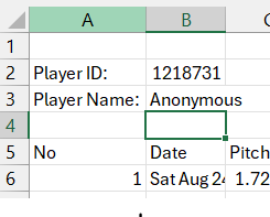
Now, I wanted to know immediately how well this worked, so I dumped it into an Excel spreadsheet.

pitching_data_df.to_excel('brevard.xlsx', index=False)

Next Steps

Now that I have my practice data and my game data in DataFrames, I can start merging in the performance results when displaying practice data and drawing conclusions.

This series includes:

Categories: Python | Tags: , , , , , , , , , , , , , | 4 Comments

Aggregating CSV Data into DataFrames: Rapsodo Pitch Data

This week I met with Vinny Carone, the Head Baseball Coach at Brevard College, to talk about the data I’ve been acquiring on youth pitchers. I’ve been doing a lot of visualizations and wanted to know if they were meaningless visualizations. I do have some improvements to make based on that and I also got some CSV exports of Rapsodo data to work with. I’m very excited about the potential for insights and the opportunity to see them applied.

Quick Point on the Data Sources

The data I’ve been using comes from my PitchLogic baseball, which has some electronics in it to sense and transmit its movement. I’ve been exporting the data into CSVs and doing visualizations. When I export, I specify the data range for the data that I want and get all pitches thrown.

The college team is using the more expensive hardware – Rapsodo 3.0 – which gives much of the same data and location data that PitchLogic does not. It can also export data into CSVs. So far, we have only seen how to do it for individual players. So, aggregation and tagging of data to use all of the data was my first task.

Walking the directory

Since I want to get data from many different files, we need to walk the directory. First, we have to import the os functions, so we’ll be able to create our DataFrames using pandas.

import os
import pandas as pd

# Directory containing the Rapsodo Data files
rapsodo_data_dir = 'Rapsodo Data'

# Initialize an empty list to store player data
data = []

Looping through all the files is now actually really simple. You don’t need to specify anything, except which directory to use.

# Loop through each file in the directory
for filename in os.listdir(rapsodo_data_dir):
if filename.endswith('.csv'):
# Construct the full file path
file_path = os.path.join(rapsodo_data_dir, filename)

Scraping the Player ID and Player Name

The nice thing when viewing the Rapsodo CSV files in Excel is that it gives you a label identifying the player (anonymized here) by ID and name. This is great when I’m viewing one player, but not real useful when I want to aggregate all the data and keep it tagged by player. So, we have to first treat the CSV file as text, then go back to read the data into the DataFrame.

        # Read the file as text in order to get Player ID and Player Name
try:
with open(file_path, 'r') as file:
for _ in range(3):
line = file.readline()
if not line:
break
if "Player ID:" in line:
player_id = line.split('"Player ID:",')[1].strip()
if "Player Name:" in line:
player_name = line.split('"Player Name:",')[1].strip()
except Exception as e:
print(f"Error reading {file_path}: {e}")

The AI in my dev environment in DataCamp urged me to use try-catch for error-handling. It’s always nice to know why and where an error occurred, so catch those exceptions!

Building that DataFrame

Once again, Python is pretty slick at how it handles data. Simple and elegant.

Read the CSV with all 106 columns into our temporary DataFrame, df, add columns at the front tagging each row with player ID and player name. Then, we put each temporary df into a list of DataFrames so we can concatenate them smoothly.

        # Read the file as CSV, skipping the first 4 lines in order to just get pitch data
try:
df = pd.read_csv(file_path, skiprows=4)

# Add Player ID and Player Name columns
df.insert(0, 'Player ID', player_id)
df.insert(1, 'Player Name', player_name)

# Append the DataFrame to the list
data.append(df)

except pd.errors.ParserError as e:
print(f"Error reading {file_path}: {e}")

# Concatenate all DataFrames in the list
final_df = pd.concat(data, ignore_index=True)

Conclusion

Now that I’ve got 2024-2025 Rapsodo data all in a single file, I can start working on team wide and individualized visualizations. One of the keys in our discussion was to create our own Stuff+ metric since we don’t have access to anyone else’s. That’s going to be the next blog post!

This series includes:

Categories: Data Wrangling, Python | Tags: , , , , , , , , , , , | 4 Comments

Quartile Boxes for Charting in Pitch Movement Visualizations

As I was looking at my PitchLogic movement visualizations that I’m using in coaching youth pitchers, I realized that I could use the quartile values to display how consistent their movement has been. The code is not that complex, so I wanted to make sure to share it. I imagine it will have considerably more uses than just my hobbyist one.

Defining the function

As my Python code for pitching assessment gets more complex, I decided to start breaking out pieces as functions. I had been using cols to create multiple charts of the various pitch types, but having a chart for each pitch type makes more meaningful charts.

For clarity, I made sure to add a good docstring…

def movementCharting (player_df, type):
""" create a chart of horizontal and vertical movement with a box around 'quantile area' showing where pitches go (separate function for creating a table of all pitch types and movement)

Args:
player_df (DataFrame): PitchLogic DataFrame with 'Horizontal Movement (in)' and 'Vertical Movement (in)'
type (string): pitch type to chart

Return:
filename (String): filename of PDF in which the image is stored
"""

Building the Chart

It only takes a few lines to build the chart using Seaborn. We’ve gotten the DataFrame that contains only pitches by one player and we trim it to only pitches of the type we’re charting.

    movement_df = player_df[player_df['Type']==type]
movefig = sns.relplot(x='Horizontal Movement (in)', y='Vertical Movement (in)', data=movement_df, kind='scatter')

Then we compute our quartile values and draw the box on the plot. I’ve commented out the lines for each mean value, since they added visual complexity without making the chart more meaningful. YMMV

    # Calculate mean and confidence intervals
    mean_horiz = movement_df['Horizontal Movement (in)'].mean()
    mean_vert = movement_df['Vertical Movement (in)'].mean()
    ci_horiz = movement_df['Horizontal Movement (in)'].quantile([0.25, 0.75])
    ci_vert = movement_df['Vertical Movement (in)'].quantile([0.25, 0.75])
        
    for ax in movefig.axes.flat:
#        ax.axhline(mean_vert, color='red', linestyle='--')
#        ax.axvline(mean_horiz, color='blue', linestyle='--')
        ax.hlines(ci_vert[0.25], ci_horiz[0.25], ci_horiz[0.75], color='blue')
        ax.hlines(ci_vert[0.75], ci_horiz[0.25], ci_horiz[0.75], color='blue')
        ax.vlines(ci_horiz[0.25], ci_vert[0.25], ci_vert[0.75], color='red')
        ax.vlines(ci_horiz[0.75], ci_vert[0.25], ci_vert[0.75], color='red') 

A couple of lines to put in the title in an appropriate spot….

    movefig.fig.subplots_adjust(top=0.85)  # Adjust the top to make space for the title
movefig.fig.suptitle(type + ' Movement Profile for ' + playerDisplay, y=0.90) # Move the title upward

Returning from our function

As noted in the docstring, we’re returning the filename as the value from the function. That gets dropped into an array so that it can be processed using Automate PDF Creation from Data Visualizations with Python

    filename = playerfigStorage + '/' + type + ' Movement Profile.jpg'
movefig.savefig(filename)
return filename

Conclusion

Visualizations aren’t hard to create using Python and there are many ways to make them more meaningful without excessive coding. As I work with my pitchers and they learn more about using this inter-quartile range box, they might pick up some technical knowledge and understanding of how to use visualization in their own lives.

This series includes:

Categories: Python, Visualizations | Tags: , , , , , , , , , , | 4 Comments

Blog at WordPress.com.