
This week I met with Vinny Carone, the Head Baseball Coach at Brevard College, to talk about the data I’ve been acquiring on youth pitchers. I’ve been doing a lot of visualizations and wanted to know if they were meaningless visualizations. I do have some improvements to make based on that and I also got some CSV exports of Rapsodo data to work with. I’m very excited about the potential for insights and the opportunity to see them applied.
Quick Point on the Data Sources
The data I’ve been using comes from my PitchLogic baseball, which has some electronics in it to sense and transmit its movement. I’ve been exporting the data into CSVs and doing visualizations. When I export, I specify the data range for the data that I want and get all pitches thrown.
The college team is using the more expensive hardware – Rapsodo 3.0 – which gives much of the same data and location data that PitchLogic does not. It can also export data into CSVs. So far, we have only seen how to do it for individual players. So, aggregation and tagging of data to use all of the data was my first task.
Walking the directory
Since I want to get data from many different files, we need to walk the directory. First, we have to import the os functions, so we’ll be able to create our DataFrames using pandas.
import os
import pandas as pd

# Directory containing the Rapsodo Data files
rapsodo_data_dir = 'Rapsodo Data'

# Initialize an empty list to store player data
data = []
Looping through all the files is now actually really simple. You don’t need to specify anything, except which directory to use.
# Loop through each file in the directory
for filename in os.listdir(rapsodo_data_dir):
    if filename.endswith('.csv'):
        # Construct the full file path
        file_path = os.path.join(rapsodo_data_dir, filename)
Scraping the Player ID and Player Name
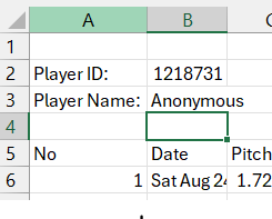
The nice thing when viewing the Rapsodo CSV files in Excel is that it gives you a label identifying the player (anonymized here) by ID and name. This is great when I’m viewing one player, but not real useful when I want to aggregate all the data and keep it tagged by player. So, we have to first treat the CSV file as text, then go back to read the data into the DataFrame.
        # Read the file as text in order to get Player ID and Player Name
        try:
            with open(file_path, 'r') as file:
                for _ in range(3):
                    line = file.readline()
                    if not line:
                        break
                    if "Player ID:" in line:
                        player_id = line.split('"Player ID:",')[1].strip()
                    if "Player Name:" in line:
                        player_name = line.split('"Player Name:",')[1].strip()
        except Exception as e:
            print(f"Error reading {file_path}: {e}")
The AI in my dev environment in DataCamp urged me to use try-catch for error-handling. It’s always nice to know why and where an error occurred, so catch those exceptions!
Building that DataFrame
Once again, Python is pretty slick at how it handles data. Simple and elegant.
Read the CSV with all 106 columns into our temporary DataFrame, df, add columns at the front tagging each row with player ID and player name. Then, we put each temporary df into a list of DataFrames so we can concatenate them smoothly.
        # Read the file as CSV, skipping the first 4 lines in order to just get pitch data
        try:
            df = pd.read_csv(file_path, skiprows=4)

            # Add Player ID and Player Name columns
            df.insert(0, 'Player ID', player_id)
            df.insert(1, 'Player Name', player_name)

            # Append the DataFrame to the list
            data.append(df)

        except pd.errors.ParserError as e:
            print(f"Error reading {file_path}: {e}")

# Concatenate all DataFrames in the list
final_df = pd.concat(data, ignore_index=True)
Conclusion
Now that I’ve got 2024-2025 Rapsodo data all in a single file, I can start working on team wide and individualized visualizations. One of the keys in our discussion was to create our own Stuff+ metric since we don’t have access to anyone else’s. That’s going to be the next blog post!

